NinjaMock
NinjaMock is a wireframe design tool made for early stages of UX design and planing.
I met with the owner of the site to learn that users were leaving or would create an account and then stop using it within a few days or weeks. The dated look and payments page of NinjaMock were the main issues causing customers to leave.
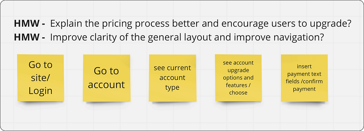
“How might we improve navigation and site layout?
How might we explain the pricing process better?”
Problem / 问题:
User's are leaving because the site’s layout and features are both dated and aren't functioning as optimal as competing sites.
Solution / 回答:
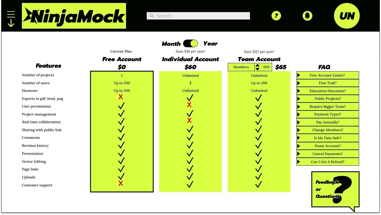
Consolidate menus, make navigation more streamlined, and update the look. Users to be able to see which account type they currently have and compare other account types to purchase.
Role / 角色:
Researcher
UX Designer
UI Designer
Tools / 工具:
NinjaMock
Figma
Miro
Google Docs
Google Meet
Research / 研究:
I sought feedback by making a series of tasks for participants to complete in order to test my suspicions.
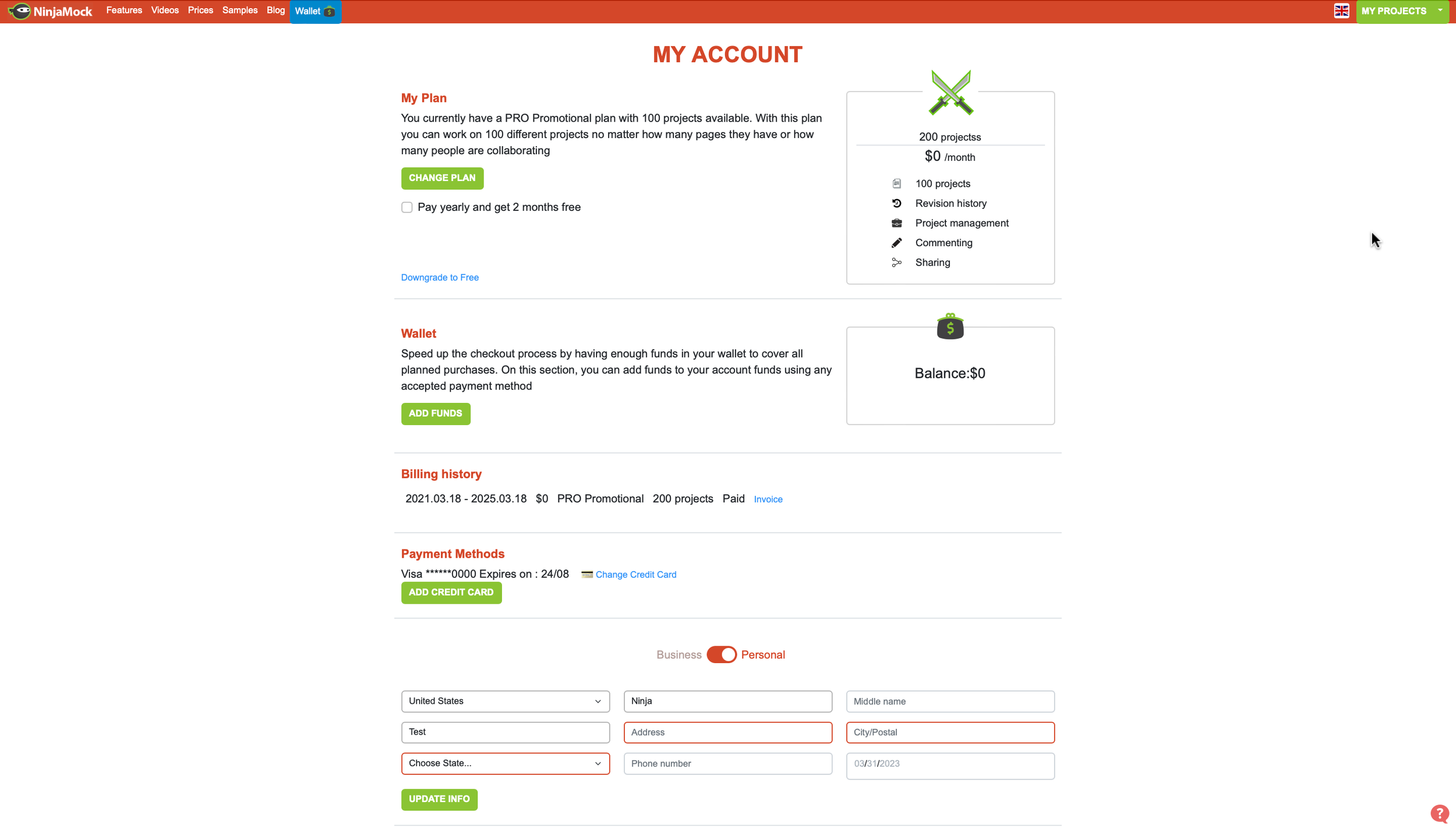
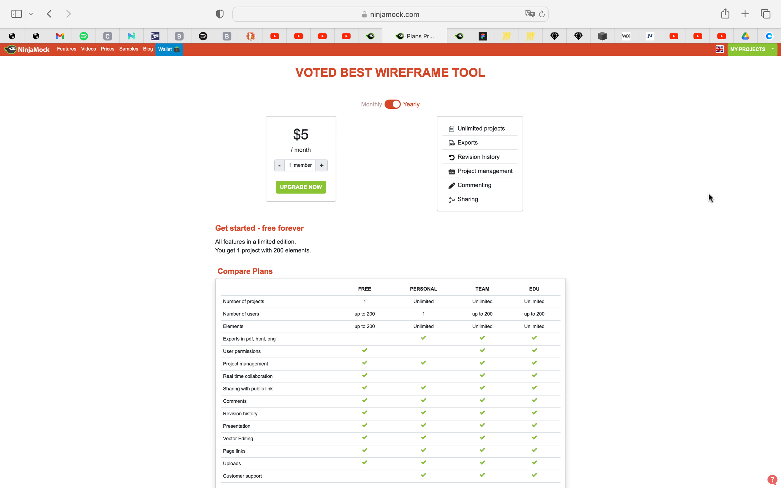
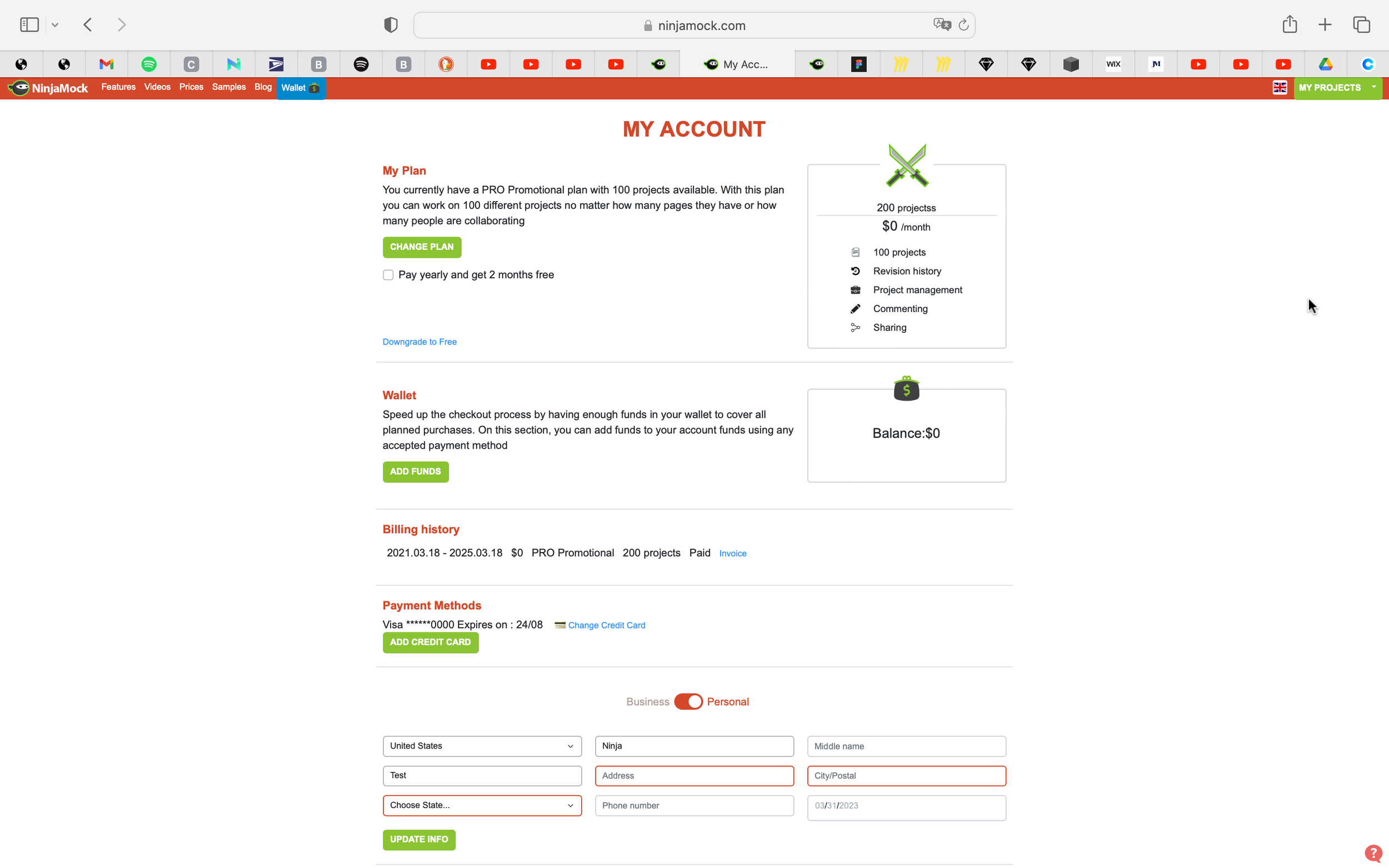
The biggest issues were around site navigation and understanding the what account a user had and how to purchase or upgrade to a different account type.
I began asking and mapping out a few How Might We's.
I aimed to redesign three features:
Redesign the header for greater navigation and streamline organization.
Redo the color scheme to better direct user's focus.
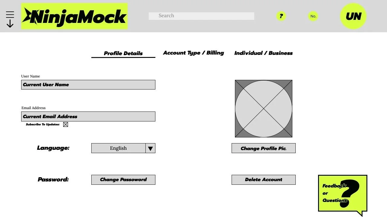
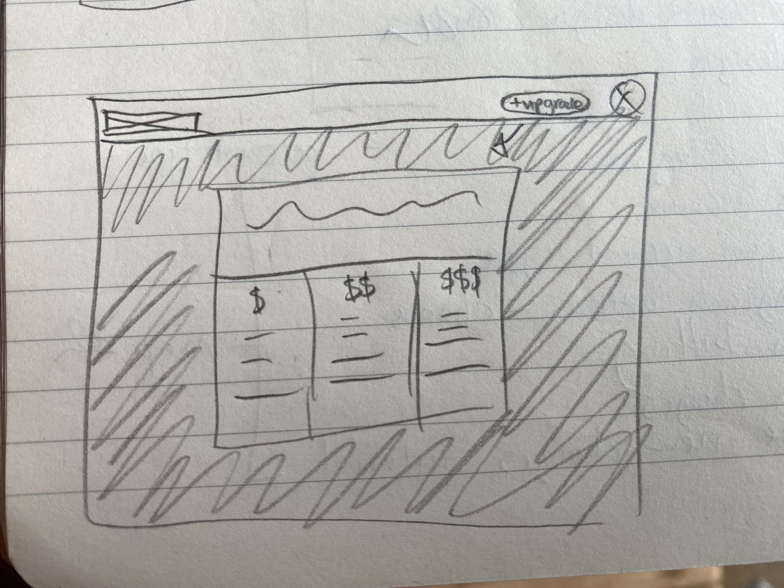
Restructure the accounts page for clarity of current account type and the comparison of account types for purchase.
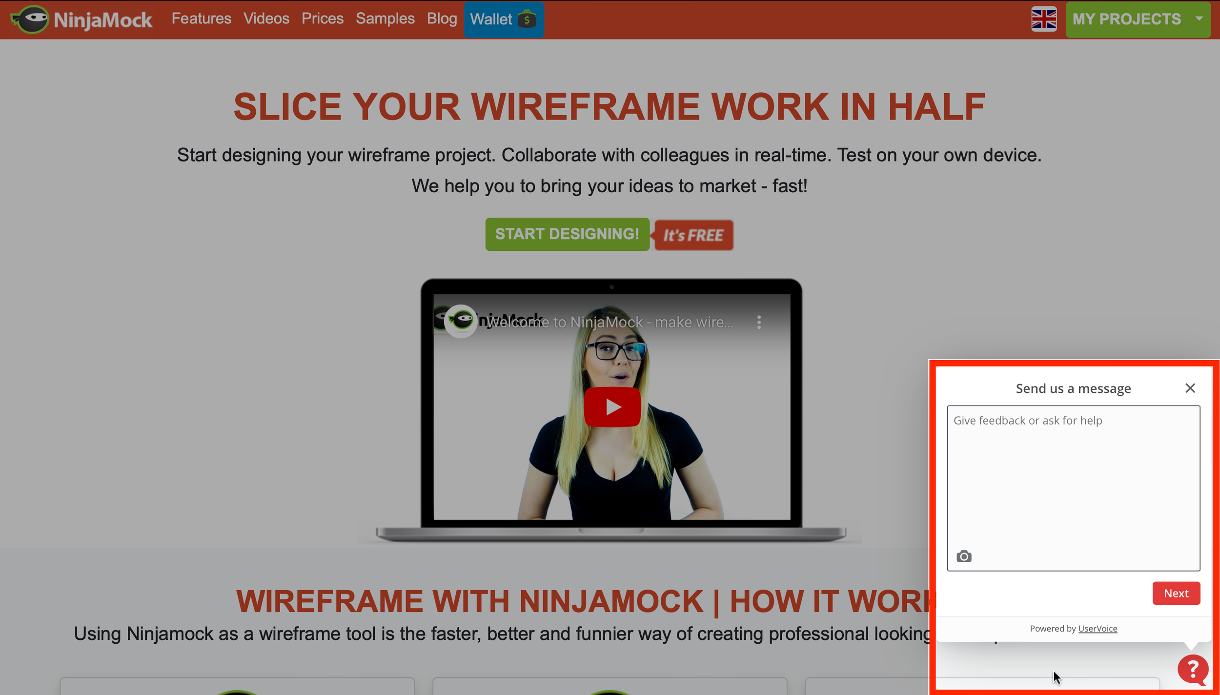
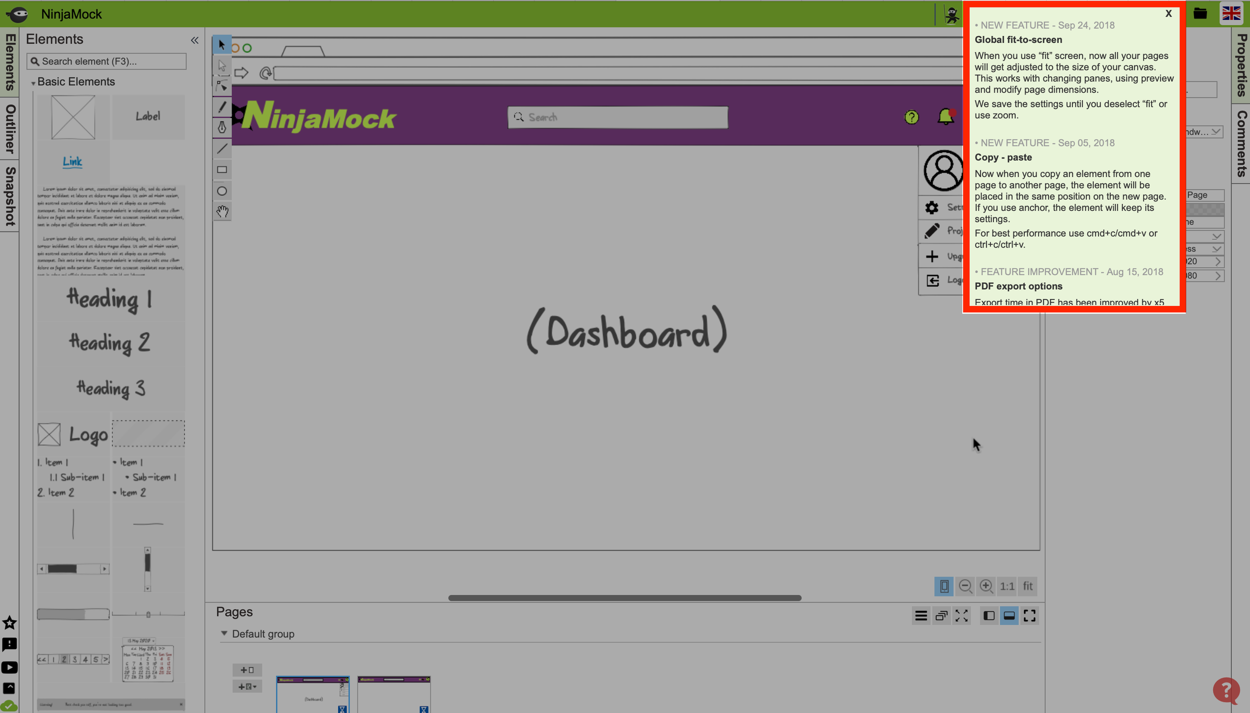
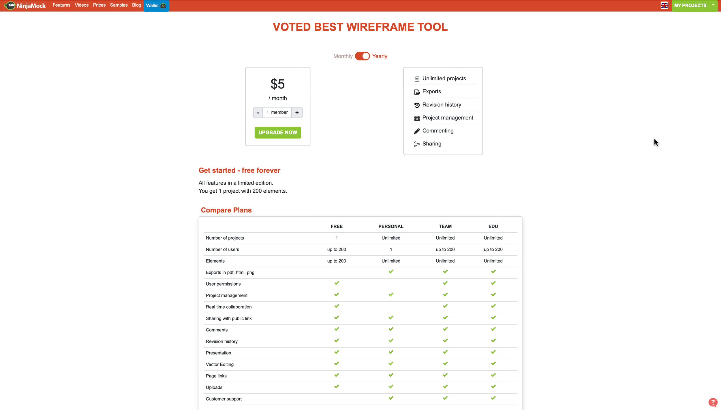
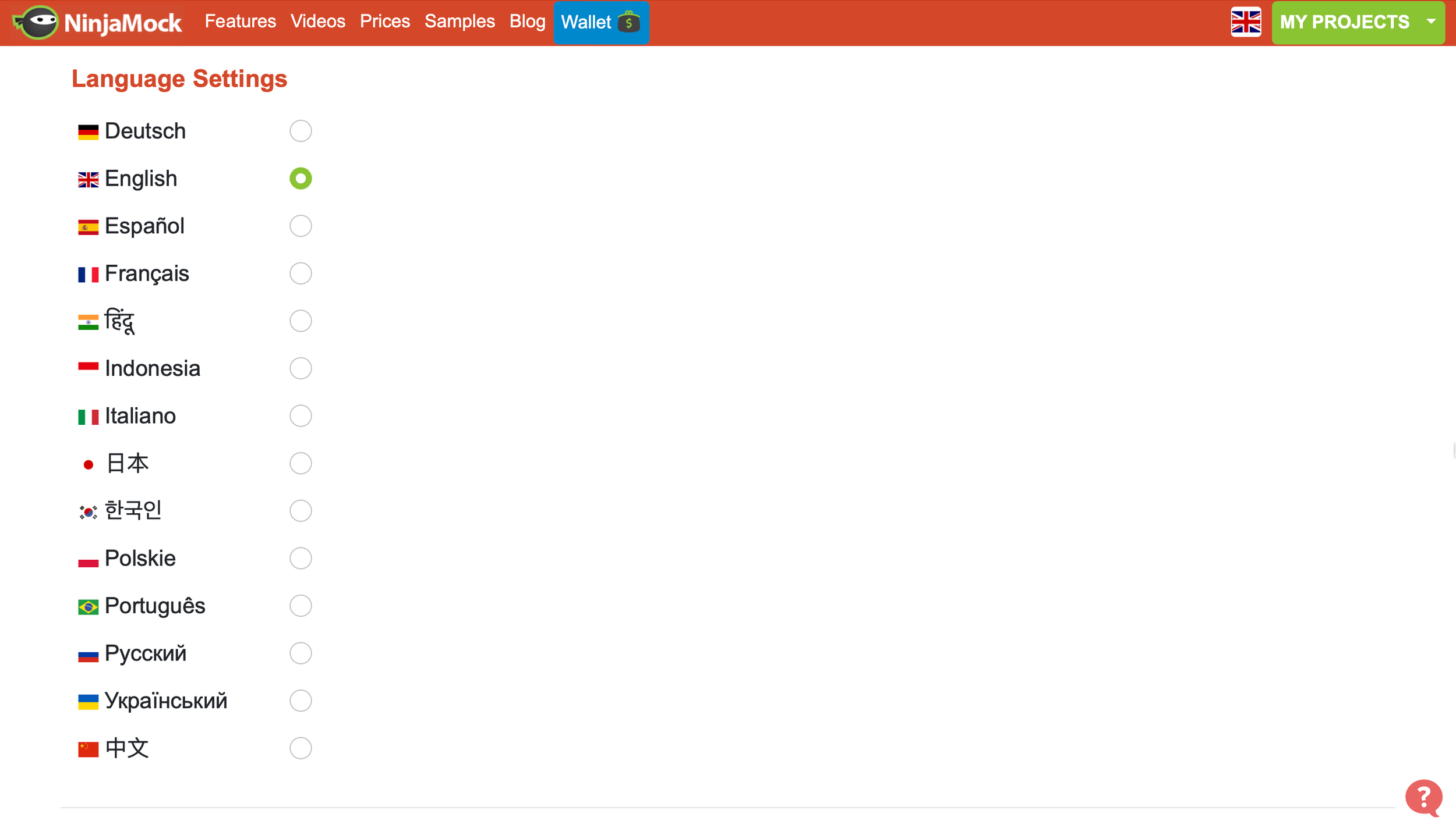
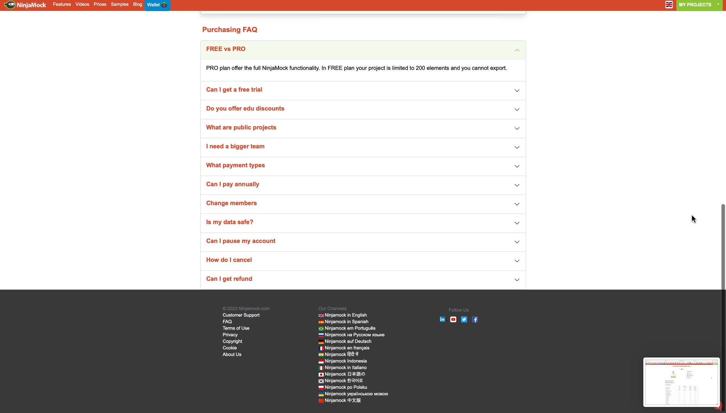
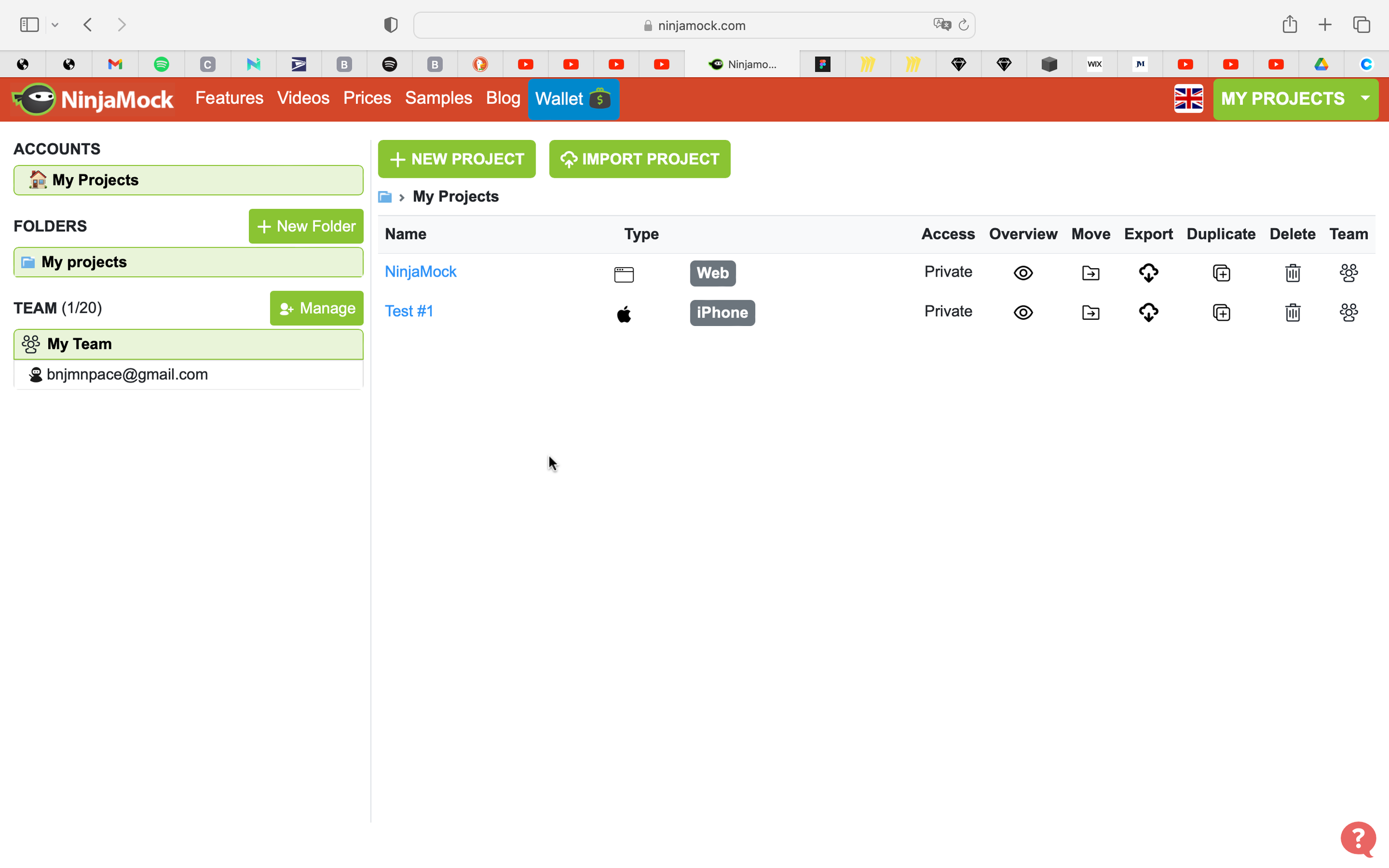
Below are screen shots of NinjaMock at the time with notes I made about issues I encountered on different pages.
Sketches / 草图:
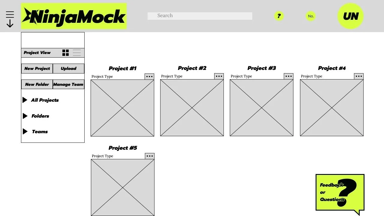
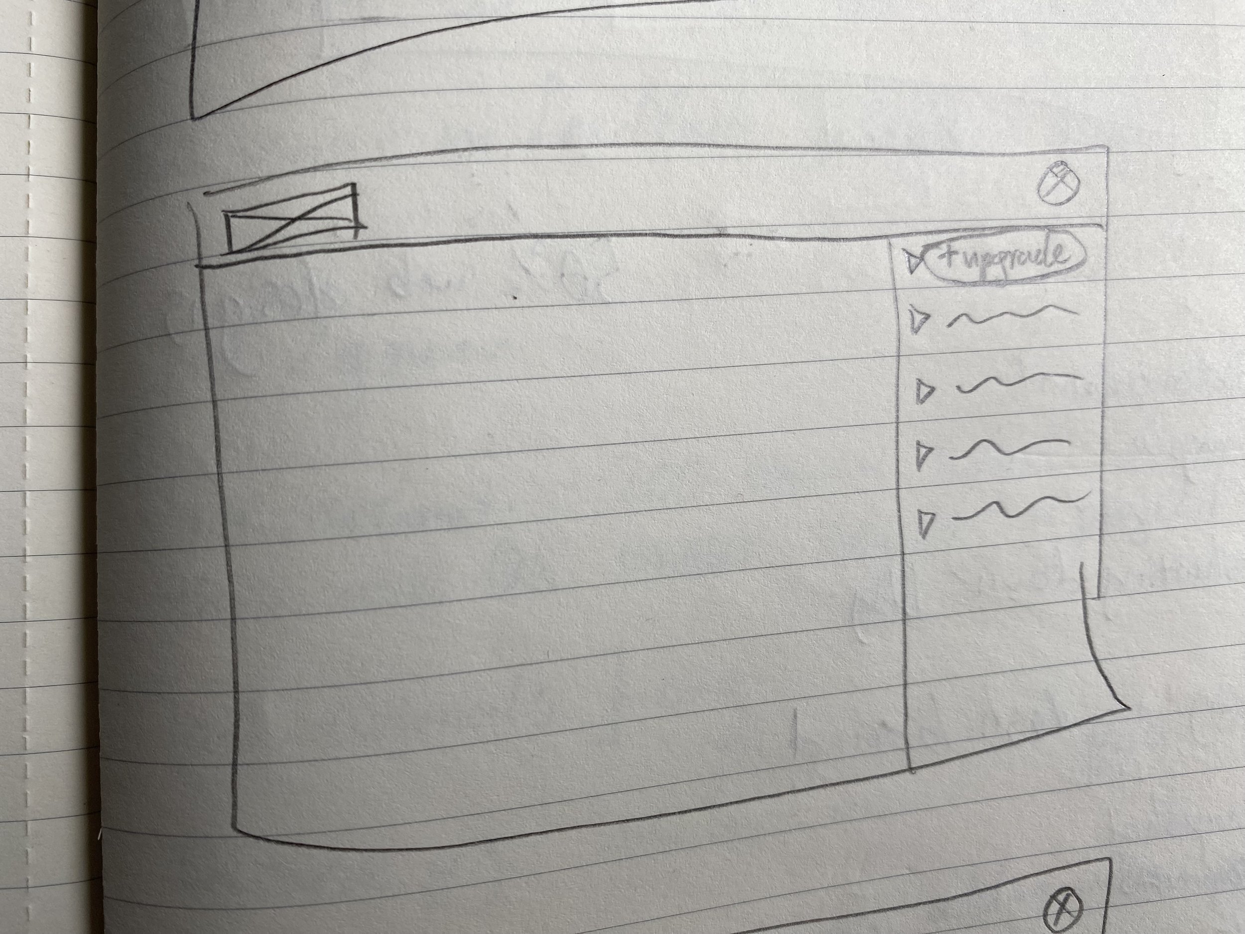
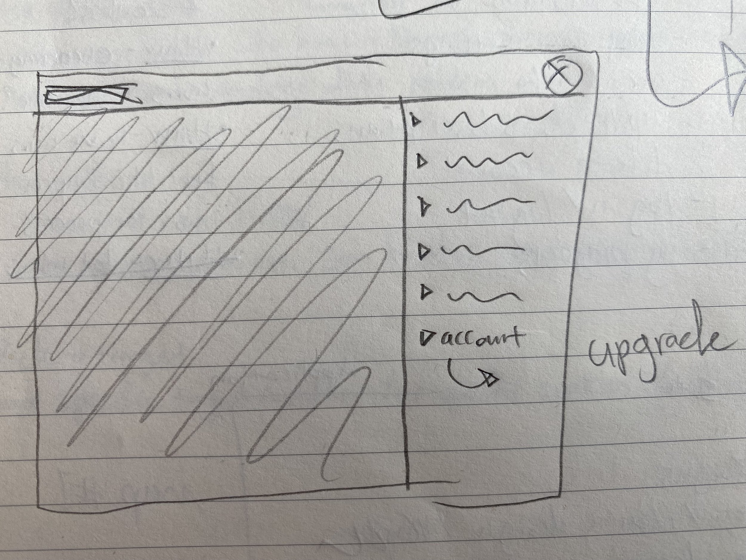
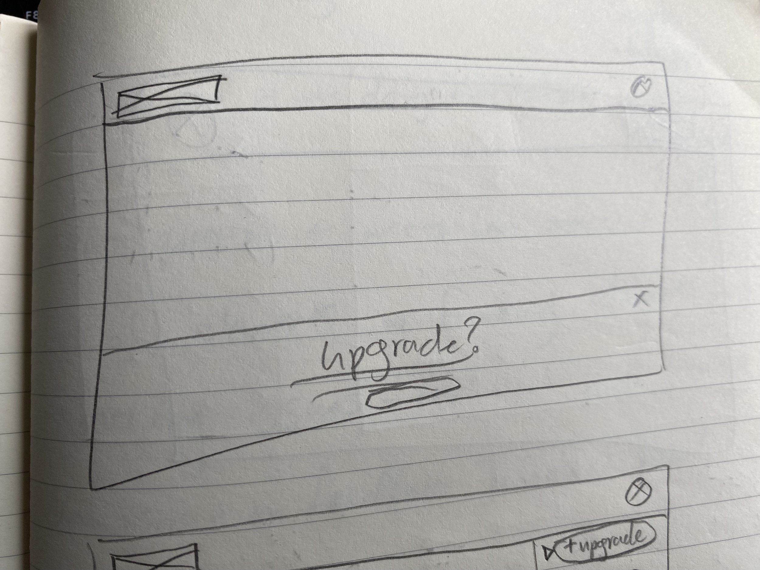
I tried to make changes minimal at first, sticking a little closer to the original design but eventually experimenting more with drop downs or permanent side menus.
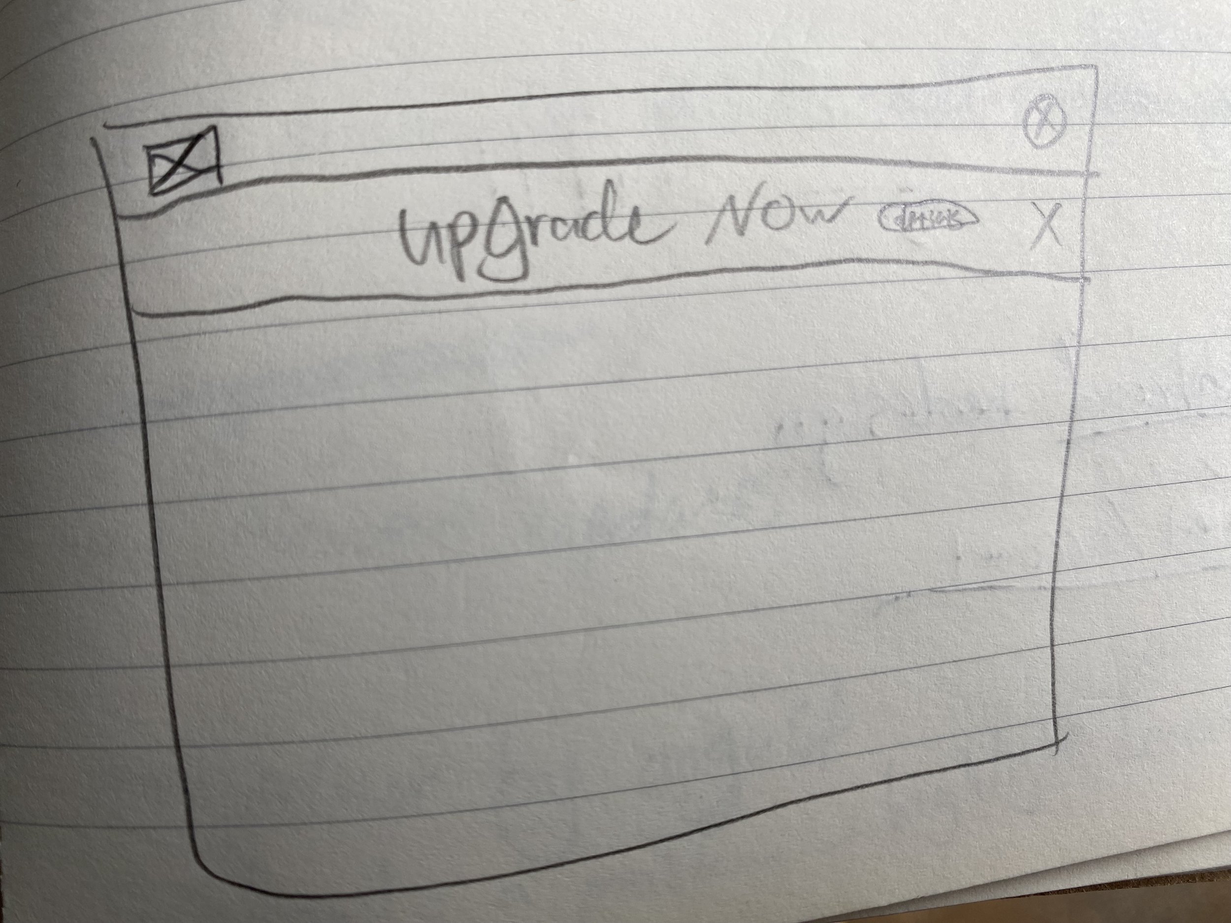
I liked the idea of maximizing screen space for users who would need plenty of screen room for their designs so I decided to implement two dropdown menus.
The location for users to upgrade their account type was a crucial detail since this is the only source of income for the company currently.
I considered banners at the header and footer, but with two dropdown menus in place, it made more sense to locate the upgrade options there.
Styleguide & Wireframes
/ 羊式和框架:
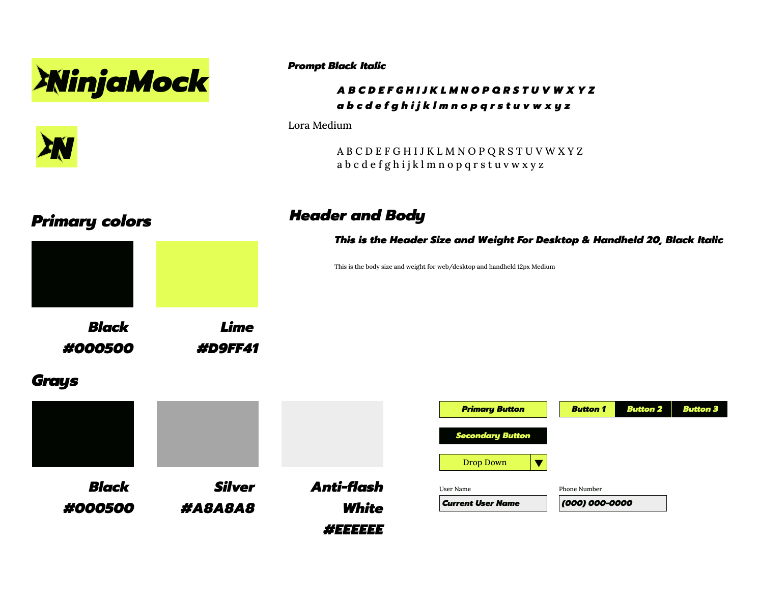
To help user’s focus I:
Reduced the number of colors.
Used Prompt Black Italic as a bold eye-catching font.
Used Lime for its command as a color.
High Fidelity 1.0
/ 高保真度 1.0:
I wanted to design the page to be less of an endless scroll, but my current solution was not satisfactory.
testing revealed a few critiques:
Redundant arrow under the hamburger menu.
An overly large feedback button.
Comments that the payment page was overcrowded.
Features not clear due to crowding and lack of lines to separate each feature.
High Fidelity 2.0
/ 高保真度 2.0:
With the final iteration many changes were made:
Swapped the Lime to a green closer to the original NinjaMock green, and used more sparingly.
Popup menus have a white background instead of black.
User Name Icon is now in red for contrast red.
Corners have been rounded for modernizing.
The feedback button was moved to the header.
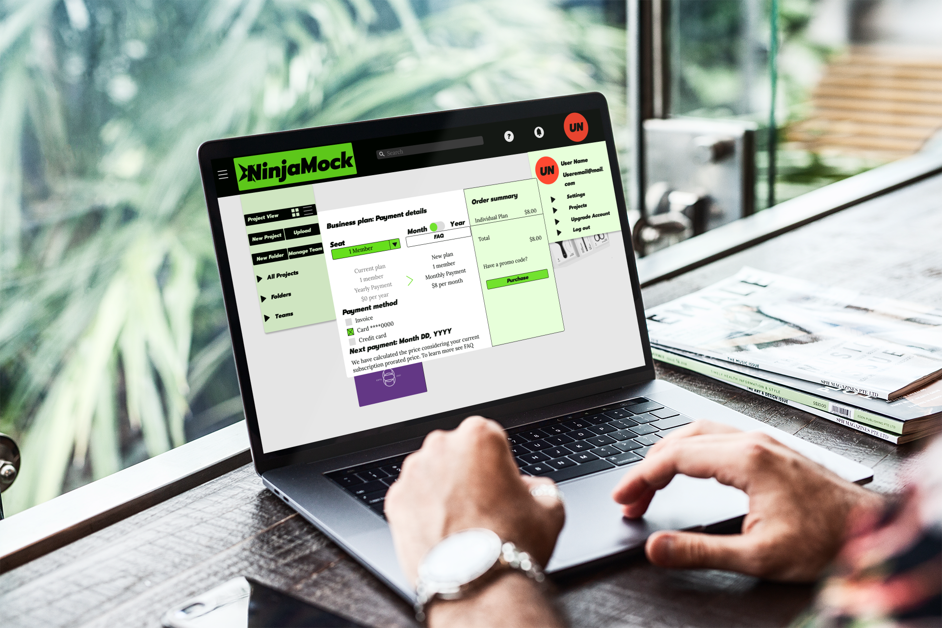
Payments have been totally altered.
Payment shows up as a popup with simplified information with order summery details.
The FAQ button takes users to a separate page with summarized details.
Final Thoughts
/ 最后的想法:
NinjaMock was an excellent opportunity to work with a stakeholder who’s product directly effects the UX industry.
I would have liked to work closer with the stakeholders on internal user numbers and look at product feedback first hand to see what other sorts of issues to address along with the overall layout and function of the NinjaMock tool.

